Case Study
Chubb Claims
Chubb Insurance is a large global corporation that prides itself in taking calculated risk for their clients. The company excels in the categories of auto, home, watercraft, small and large businesses.
Overview
Client: Chubb Claims
Problem Statement: The claims center came to the UX team with a issue within the adjusters workflow. The adjusters were overworked with hundreds of claims that took far too long to process. The adjusters had two legacy systems that worked in that would often duplicate and extend their work. This also made it harder to filter through file notes, documents, and other important parts of the claim.
Audience: Claims Adjusters
Roles:
UX Designer
UI Designer
UX Researcher
Tools:
Figma, FigJam, Google Forms, PowerPoint, Webex, Mural, Google Docs, UserZoom
Timeline: 8 weeks
Deliverables: Competitive Analysis, User Surveys, User Persona, User Flows, User Interviews, Service Blueprint, Wireframes, Usability Tests, Prototype
Problem
Project Brief: The client would like to reduce the time spent looking for important information and switching between multiple systems and tools to do simple tasks. The MVP should address all points listed below.
Main Focus Points
No.1
Create one simple platform for adjusters to work in without switching between systems for tasks.
No.2
Create a user friendly filter for adjusters to find their file notes, documents, and other important information.
No.3
Update the UI to give adjusters a more modern and cleaner user experience.
DISCOVER
Research
Competitive Analysis:
To start this project the team looked at other insurance companies to see how they approach their internal systems. We didn’t have easy access to this so we interviewed adjusters that worked at other companies to ask for their insight.
Apps:
ClaimsConnect, ClaimsVision,
User Surveys & Interviews:
Important Interview Quote:
"
Results
Most survey participants:
- Women
- 26-30
- Want to save money
- Value seeing the whole trip live
Additional Feature:
Because of this finding we added a 4th feature to our project brief.
No.4
Give the rider the ability to view the entire bus journey with multiple stops, so that they can know what other buses they need to include in their planning
DEFINE
Persona
We added all the data together to create the persona below
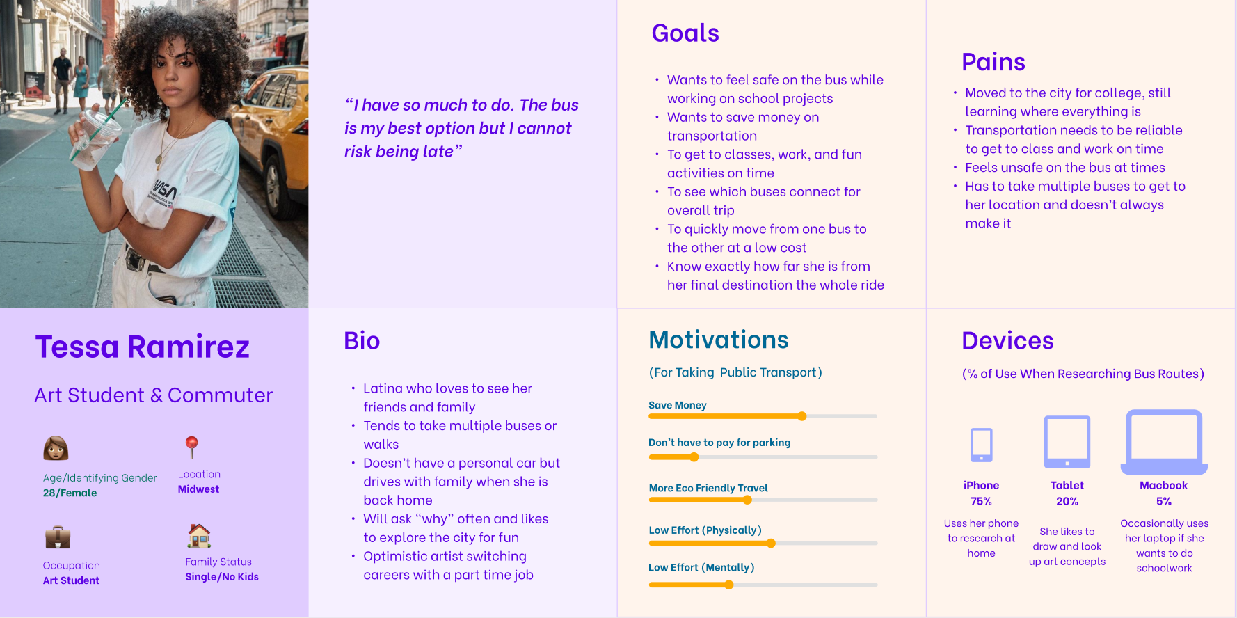
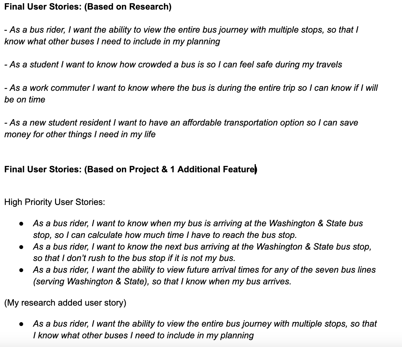
User Stories
High Priority Stories:
The next step was to think like Tessa and define what she would need by creating user stories. The team then narrowed it down to the highest priority stories.
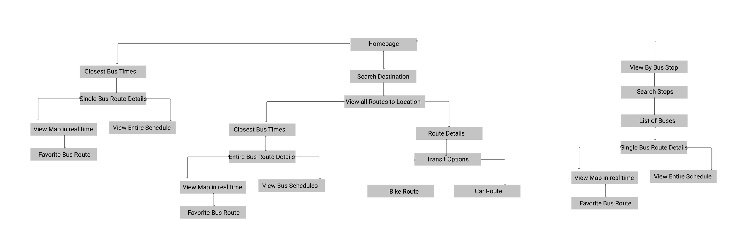
User Flows & Site Map
The team then created a digital user flow to showcase exactly what steps Tessa would take to achieve her goals in the app.
User Flows:
Site Map: This is the first draft of my site map. It was later updated to add more buttons on the homepage

DESIGN
Sketches & Wireframes
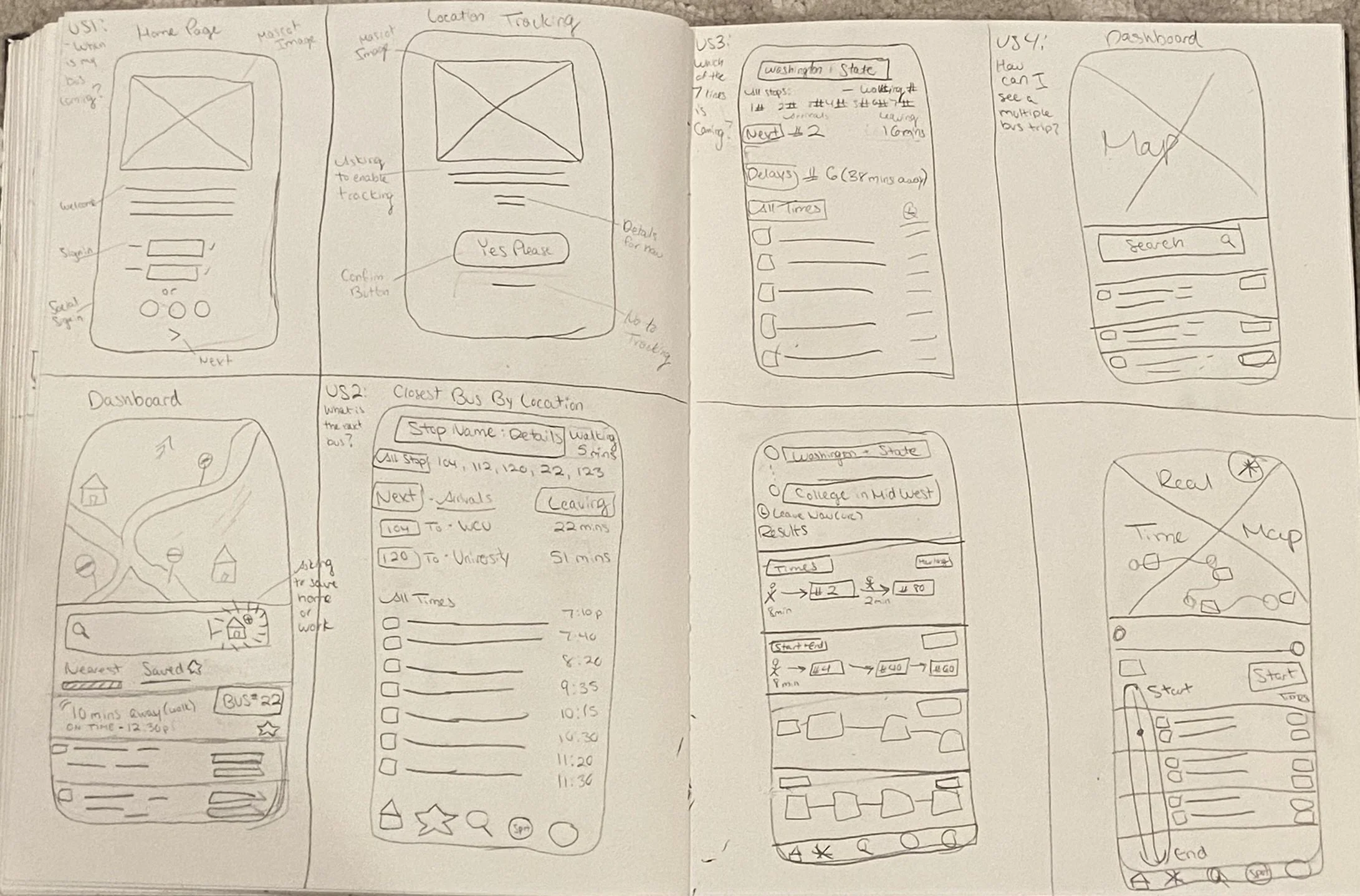
Early sketches:
These are the first early sketches of the app. The best way to visualize our screens is to draw it out quickly to get as many ideas down as possible using the Crazy 8 method.
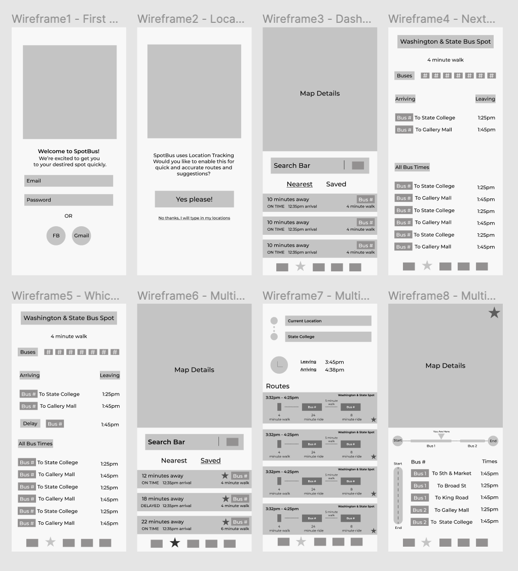
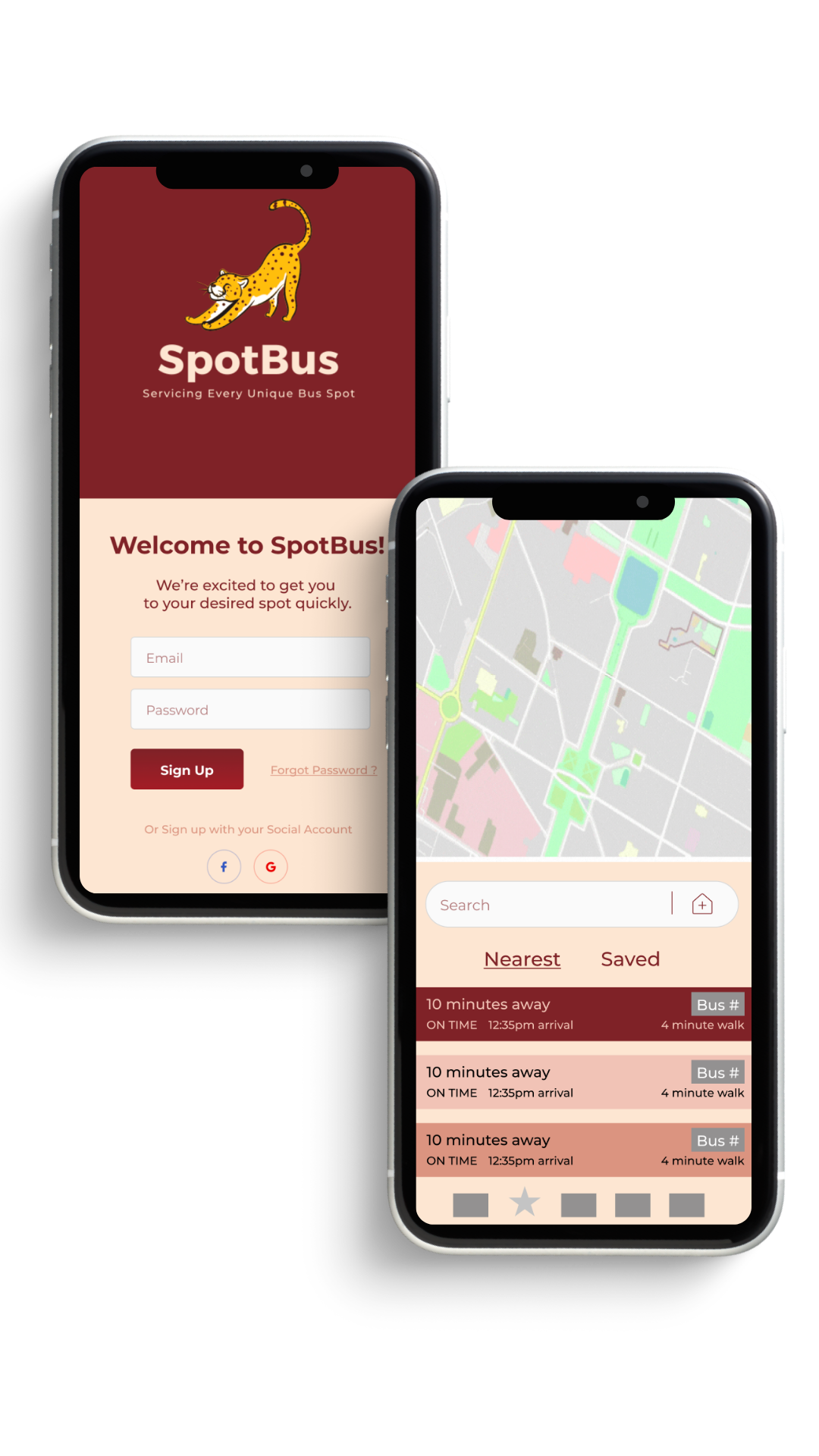
Digital Wireframes:
These are the first digital wireframes for our bus app
Branding
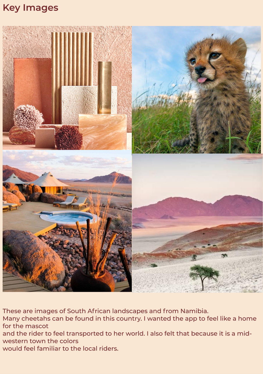
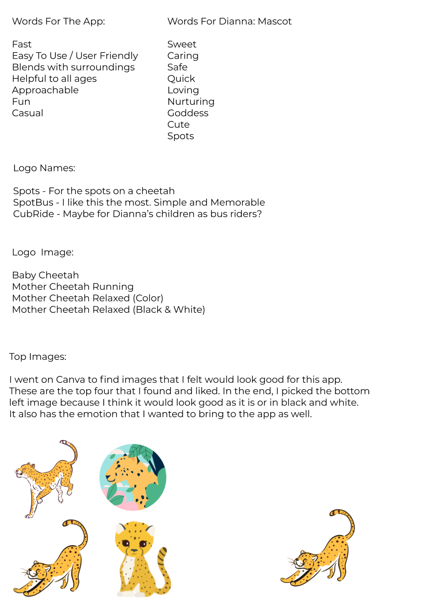
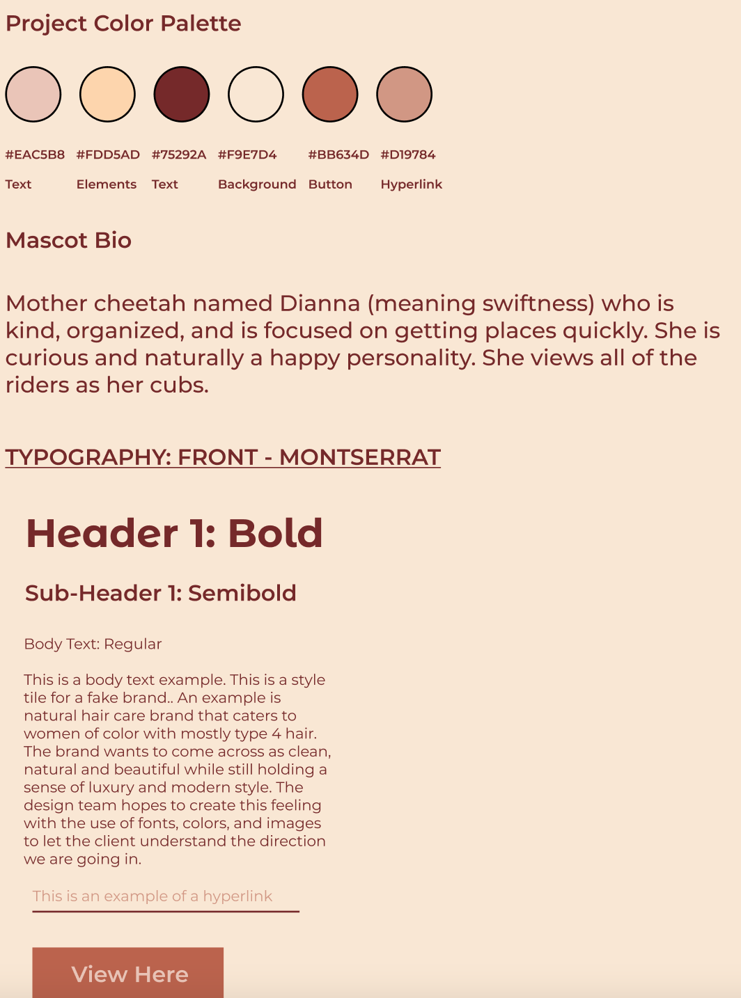
Not to be too bias, but this was probably my favorite part of the project. I spent time thinking about every part of what would make this brand come to life. I found myself first thinking of how speed is so important to Tessa. From there I thought of a cheetah and where you would find a cheetah. I pictured the landscape and colors that would be around it and how the South African landscape colors were not too far off from colors in the midwest. I created a mood board, keyword sheet, and more to create the mascot Dianna. She’s a mother cheetah focused on safety and fun for all her commuter cubs. She sees each bus stop as a spot and wants to make sure that it is clear when people should get on and off of the bus.
Mood Board & Design Thinking
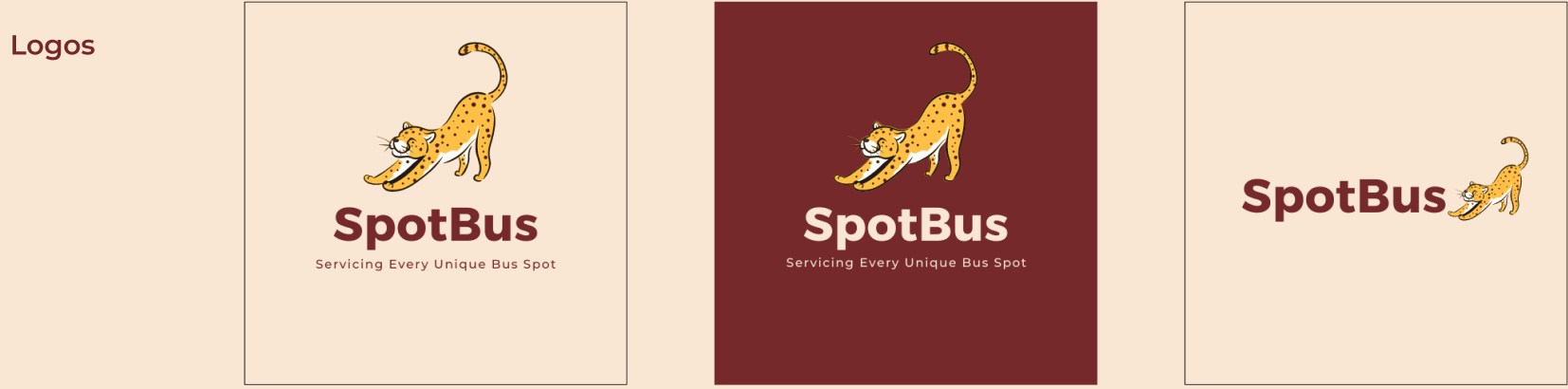
Logo Icons
Typography & Color Palette

DEVELOP
High Fidelity Mock Ups
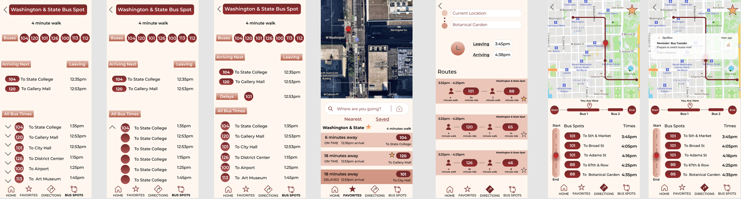
Examples of the first to final drafts of our app before we sent everything out for testing. You can also view the clickable prototype below.
1st Draft
Finished Draft
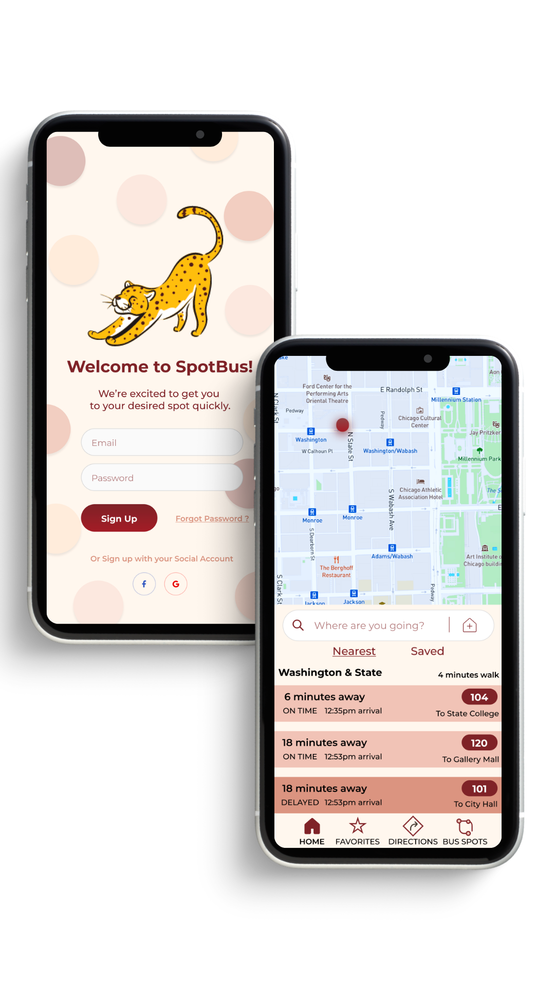
High Fidelity Prototype

DELIVER
Usability Testing
I performed a test with 4 people using the prototype above. This was done with 3 people through Maze unmoderated. One person performed the test with me through Zoom and spoke out loud about their thoughts and feelings. I was able to then make a few changes to the design.
For example,
I added back buttons
Changed the shape of the titles (so they would not be mistaken for buttons)
Created a drop menu for times
I added a second dot for the bus transfer
Made sure that all of my colors met accessibility standards
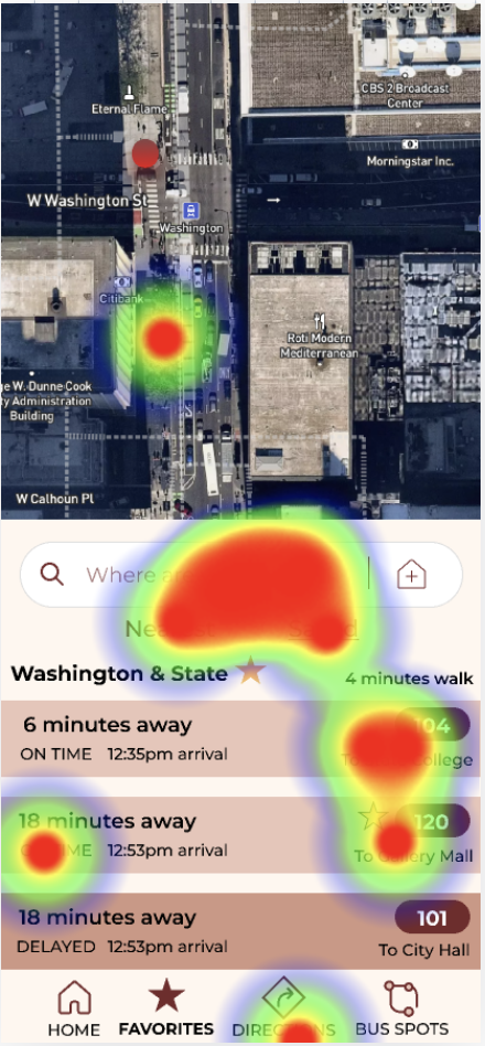
Heat Map for User Testing
Iterations
Conclusion
Solution:
The final suggestions made to the company were to place value on their clients seeing the entire trip from start to finish. People want to know what is going on throughout the trip. This means showing delays, bus transfers, streets, and having visual maps to guide people. SpotBus was able to cover all of the main concerns and deliver an extra feature that would make their audience eager to download it.
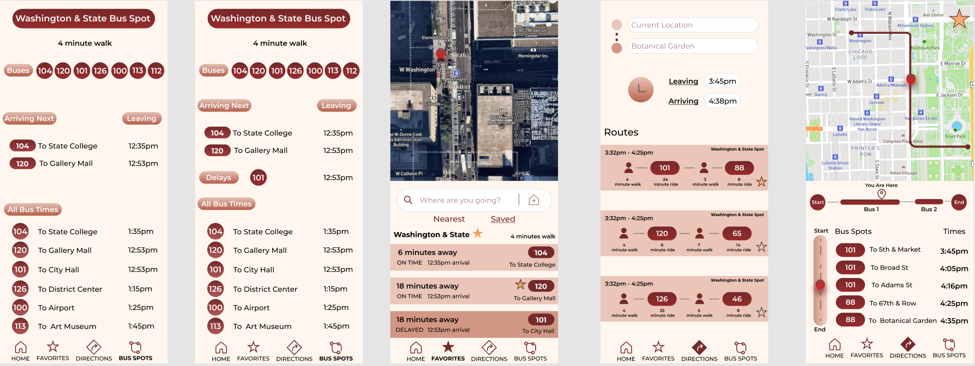
Final Mockups

Final Thoughts & Suggestions
Show the entire trip
Set reminders for bus transfers
Make the branding lively and bright
Be transparent about delays
Use location tracking & maps to make information very accurate
Lessons Learned
It is so important to trust the idea of an MVP. Throughout my creative journey I have always been one to try to make something perfect. With design it is important to put out the first best effort to test it and get ready to make changes. Nothing is perfect and that’s okay. What matters is that we continue to try and make improvements along the way to give people the best experience possible.